CI
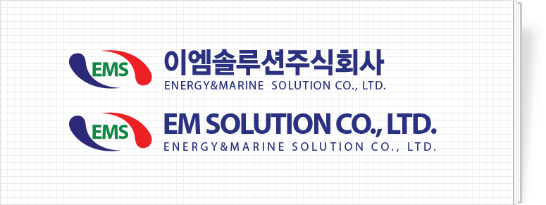
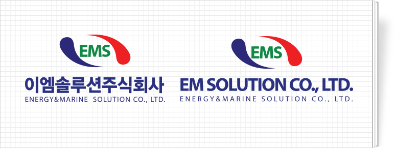
Introduction of CI and signature implying EMS’s identity

Power of future oriented vision
The basic concept of EM Solution’s corporate image is a strong trust that comes from the accumulated harmony of EM Solution’s perfect technology and man power. The status of EM Solution and next generation of alternative energy industry are embodied in form of Taiji and flow of energy source. Providing total solutions(technology development∙realization of system)in the field of ship and environment are expressed in well condensed power that is expressed in moderate form of expansion. Which means, it is showing the force of the future oriented vision.
The color system is an important visual element representing EM Solution.
The red represents the source of energy and the dignity of human,
blue represents for man power of EM Solution,
and green represents the will of EM Solution to realize an eco-friendly company.
The color system is an important visual element representing EM Solution. The red and blue color of EM Solution shows a dynamic force that are well harmonized. Therefore, the symbol shows EM Solution’s unique characteristics and uniform brand image so, its shape should not be changed and it has to be used according to the regulations. When expressing its colors, colors, brightness, and chroma have to be taken in well mannered.


